How to put text on a photo so it can be read
Writing on a photo is easy; making it readable is another matter. On a background full of colours the letters get lost, and on a phone screen even more so. This guide explains how to do it in Galion Photo and, above all, five techniques to make the text stand out without spoiling the image.
Why the text cannot be read
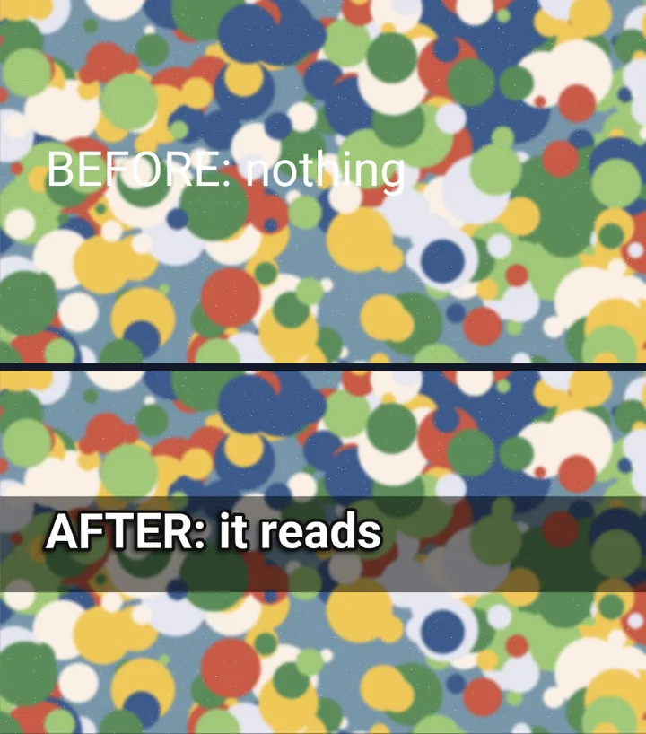
It is almost always a lack of contrast. White text on a light sky, or black text on a dark area, disappears. And if the photo has lots of detail behind the letters, the eye does not know where to look. The answer is not simply to make the text bigger, but to separate it from the background.
Step by step
- Open galiontoon.com, choose Galion Photo and open your photo with File → Open….
- Find the calmest area of the image: a sky, a wall, a plain floor. That is the best place for the text. If there is none, you will create it with the techniques below.
- Choose the Text tool (T key), click on that area and type. Use a clear font with some weight, and a generous size.
- Place the text with the On the canvas buttons in the Text panel: they centre or align the layer to the image without fine-tuning by eye.
- Give it an edge: in the Text panel, under Appearance, choose the Outer outline color and raise the Outline thickness. A thin dark outline is enough to lift light text.
- If it is still hard to read, add a shadow in Layer → Layer styles → Drop shadow…, or a band behind it, as explained below.
- Export with File → Quick export → JPG for photos, or with File → Quick export → PNG if the image has lots of text or flat colours.
Five ways to make text stand out
- Colour contrast. Light text on a dark area or dark text on a light area. It is the first thing to check, and it is often enough.
- Outline. A dark edge around light letters (or the other way round) separates them from any background. It is the YouTube thumbnail technique.
- Drop shadow. A soft shadow behind the text gives it depth. With a high blur it reads less as a shadow and more as a glow that helps legibility.
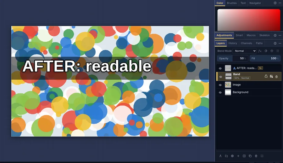
- A band or box behind. With the Shape tool (U key), draw a black or white rectangle behind the text and lower its Opacity to 40–60% in the Layers panel. If it ends up on top of the letters, drag it below the text layer in that same panel.
- Darken or blur the photo. With the photo layer selected, Image → Adjustments → Brightness / Contrast… darkens it a little, and Filter → Gaussian blur... softens the details that compete with the letters.
Which font to choose
- For headlines, heavy and narrow fonts such as Bebas Neue or Anton: many big letters fit in little space.
- For longer phrases, clean fonts such as Montserrat, Poppins or Open Sans, which read well even at small sizes.
- Handwritten and decorative fonts only for one or two words. In a whole sentence they are tiring and harder to read.
- All of them are in the text font list, under “More free fonts (catalog)…”, and can also be used in commercial designs.
Common problems
- The text gets lost in part of the photo. The background changes from light to dark behind the letters. Move the text to an even area or put a semi-transparent band behind it.
- The outline looks too thick and the letters run together. Lower the Outline thickness or enlarge the text. With small letters, a thin outline works better.
- The band covers the text. It is above the text layer. In the Layers panel, drag it below.
- When the file is opened on another computer, the font changes. If you used a font from the catalog, GalionToon downloads it again on its own when the file is opened on galiontoon.com. If it was a font from your computer, the other computer needs to have it installed.
- The text looks blurry when exported. The image was enlarged after the text was written. Work at the final size from the start and export as PNG if there is a lot of text.
Common questions
Is it free? Yes. GalionToon is free, with no account and no watermark.
Does my photo get uploaded anywhere? No. Everything happens in your browser and the photo never leaves your device.
Can I change the text later? Yes. If you save your work with File → Save, the text layer is still editable when you open it again.
Can I use the catalog fonts in commercial work? Yes. They are free fonts (SIL Open Font License or Apache 2.0) that allow commercial use; they cannot be sold on their own.
Does this work for thumbnails and social media? Yes, the techniques are the same. The guide How to make a YouTube thumbnail applies them step by step to a thumbnail.
More guides
- How to edit a photo online for free, without signing up5 min read
- How to make your first manga page in your browser6 min read
- How to make a vertical webtoon to read on a phone5 min read
- Speech balloons and speed lines for your comic5 min read
- Comic and manga page sizes: B5, A4, comic book and webtoon5 min read
- How to import your custom brushes4 min read
- How to remove the background from a photo in your browser5 min read
- How to open and save a PSD file in your browser4 min read
- How to make your first animated pixel art3 min read
- How to add subtitles to a video in your browser3 min read
- How to edit your first video in your browser4 min read
- How to make a YouTube thumbnail for free in your browser4 min read
- How to crop a photo into a circle for your profile picture4 min read
- Layer masks: what they are and how to use them4 min read
- How to resize an image for social media without losing quality4 min read
- How to make an Instagram post step by step4 min read
- How to create a sprite sheet for a video game4 min read
- Free fonts for commercial designs: how to choose them5 min read
- How to animate a character with bones in Galion Rig4 min read
- How to convert a drawing or a logo into a vector (SVG)4 min read